STRATEGY. CREATIVE DIRECTION. UX/UI DESIGN. EDITORIAL DIRECTION. ADVERTISING TREATMENTS
–
About Hyperloop TT
Hyperloop Transportation Technologies (HyperloopTT) is an innovative transportation and technology company focused on realizing the Hyperloop, a system that moves people and goods at unprecedented speeds safely, efficiently, and sustainably. Through the use of unique, patented technology, and an advanced business model of lean collaboration, open innovation, and integrated partnership, HyperloopTT is bringing the future of transportation to life. Founded in 2013, HyperloopTT is a global team comprised of more than 800 engineers, creatives and technologists in 52 multidisciplinary teams, with 40 corporate and university partners. Headquartered in Los Angeles, CA, HyperloopTT has offices in America, Europe, and Asia.
My Role
• Hands-on management of product development for
HyperloopTT interactive experiences both on and off the web
• Creative direction, design and design management
• Content tone and direction
• UX/UI design
• Managed user testing
• Brand design system
HyperloopTT interactive experiences both on and off the web
• Creative direction, design and design management
• Content tone and direction
• UX/UI design
• Managed user testing
• Brand design system
The Creative Concept
Are you ready to challenge time? The “Challenge Time” concept is based on the idea of challenges big and small. Challenges in our lives, challenges that have been met in history, and the challenges of building the Hyperloop. It also relates to challenges in spending more time with our families and more productive time for our careers. What would you do with extra time?
By putting the Hyperloop in the same category as the first moonwalk, climbing Everest, or first in flight, we are amplifying the overall story, and the statement it makes. This concept brings weight to the Hyperloop project, shining a light on the next historic milestone that can change humanity and attracts contributors and partners who are looking for challenges greater than themselves.
What we did
• Creative and design briefs
• Sketches and mood boards
• Loose wireframes
• Advertisement creative concepts
• Sketches and mood boards
• Loose wireframes
• Advertisement creative concepts
“Challenge time, challenge yourself,
challenge the world.”
challenge the world.”
UX Design
We created a detailed sitemap that mapped to content and platform database matrixes. Annotated wireframes were created for all major template and modular container types.
We created a detailed sitemap that mapped to content and platform database matrixes. Annotated wireframes were created for all major template and modular container types.
What we did
• Initial analog sketches were created to quickly get some big ideas on paper and pressure test specific concepts
• Quick user flows were generated to better define key interactions and to help envision an overall “design system” that could be refined
• A detailed set of core template wireframes were created for all platforms and modified throughout the UX/UI, prototyping and testing phases.
• A detailed content matrix that mapped directly to the sitemap was created and used for the initial content audit as well as content creation
• Created prototype for testing during the UX/UI phases
Prototyping
Low and high fidelity prototypes were created and tested at various stages of the project. We used low-fi prototypes in-house to test more detailed navigational elements, especially on mobile, and higher fidelity prototypes to test with user audiences.
What we learned
• On mobile devices, users liked seeing less information with the option of clicking to see more
• The hero module needed to be simplified to let the messaging read properly on the small screen
• Users need to see the hero area animated to get the full effect of the messaging, animated prototype coming
• Right and left arrows were not needed on as swipe scrolling was intuitive to users
• Image captions must either be clipped with ellipses or eliminated completely on mobile only
UI Design
The challenge with designing the Hyperloop user interface was rooted in lots of interactivity and keeping interface elements simple and consistent. We eliminated arrows and other common way-finding elements and opted for animated hover states that directed users to take action.
What we did
• To further amplify the “Challenge Time” concept, we created a module called the “Time Simulator” based on the original Route Simulator application we designed (Shown in more detail later in the case study). When you enter the website, you are greeted with a module that shows you just how fast and how far geographically from your current location you could have traveled on the Hyperloop in the time you have spent on the site.
• The storytelling hero module will incorporate small video clips of the Apollo moon landing and an animated rendering of the capsule as well.
• Working from user flow diagrams, we developed a series of preliminary sketches with which to start.
• We created a modularized content container system. Each could be coded and individually shared throughout the CMS system. This will give content editors flexibility without compromising the overall design.
Branded design system
A design system was created for the website and route simulator that will go on to influence many other digital projects such as onboard telematics systems and way-finding.
A design system was created for the website and route simulator that will go on to influence many other digital projects such as onboard telematics systems and way-finding.
The design system currently includes:
• Primary and secondary color palettes
• Complex organic flowing line-based pattern system
• Iconography
• Typography
• Infographic styles
• Complex organic flowing line-based pattern system
• Iconography
• Typography
• Infographic styles
Route Simulator
Want to see how little time it takes to get from Paris to Berlin, from Shanghai to Beijing, from Motueka to Timaru? The route simulator draws a route on a map and calculates variables such as the number of people transported compared to other modes of transportation, time saved, and CO2 emissions (Hyperloop has non).
Telematics UI Design
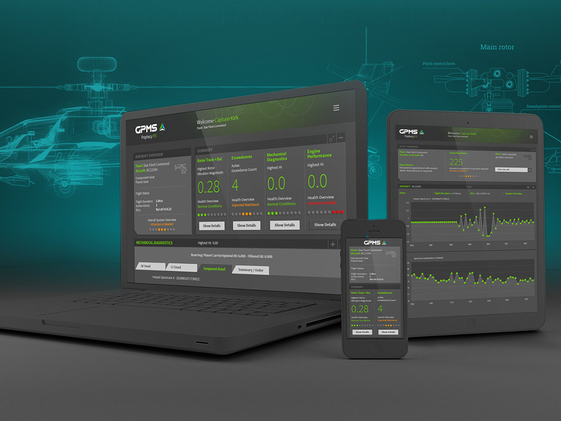
All operational variables such as vacuum pressure, levitation, speed, and all measurable aspects of the system are displayed toengineers and systems operators on telematics screens.
